Summary
Creating a responsive, consistent user interface for a 10+ year old product.
Problem space
SkillsForge provides Higher Education institutions with their own configured and branded systems. When trying to create a standardised product, SkillsForge needs a way to easily theme and brand a system without requiring developers to implement CSS for each individual system. Instead, branding and theming a system should be quick, while ensuring that the majority of the SkillsForge user interface is consistent, so that for people that are already familiar with SkillsForge will not have to relearn the system.
Methodology
I began by understanding how SkillsForge's user interface worked. What I found was a series of legacy hand written CSS, Bootstrap 3.3.6, more Bootstrap being injected by the server and on top of that, a final layer of per-installation CSS. As the CSS had been constantly written on top of existing CSS, a specificity problem had emerged previously which had been fixed with long, specific queries as well as the use of the !important property. The existing styling was not consistent across the system, changed between installations and was not responsive - making it difficult to use on mobile or tablet devices, for which we found a large proportion of our user base was using.
I began to tackle this problem by understanding how we could make the system more consistent and decided that removing customer specific CSS would be a good first step. I realised that theming a system must be easy to do both in terms of time taken and the amount of code that would be required. For such an approach to work, I researched various implementations and discovered the design system community.
I then spent some time investigating various patterns for structuring the implementation, favouring an approach that includes utility classes which would allow for code that followed the DRY (don't repeat yourself) principle. I decided that utility classes would help developers to quickly utilise commonly used styling (such as a flex box row, or a small amount of padding) - without having to add more handwritten CSS, which would end up in different locations across the application. I also took one of Harry Roberts' courses to learn about the ITCSS (inverted triangle CSS) structure. I adopted this for the structure of the SkillsForge design system as it provides an easy to understand flow of specificity throughout your CSS, removing the need for long, chained selectors that try to beat the specificity of legacy code.
Final design
The final design used the ITCSS structure, with a settings file sitting at the top, containing SCSS variables, allowing for account managers to quickly and easily tailor the design of the system to meet the branding of their customer's institution. Once a change was made to the settings and the SCSS compiled, the design system was built in a way so that the settings propagated throughout the design system. Allowing for a standardised system, flexible enough to work for all our customers.
I built the first version of the SkillsForge design system over 2-3 months, launching with the University of the Arts: London in November 2019. We then iterated on the design with feedback from the university's end-users, alongside this we began moving over the University of Adelaide's and Anglia Ruskin's SkillsForge systems on to the new design system. While there were no major problems, we did add more flexible aspects to the design system allowing for the border radius of elements and header fonts to be customised in order to meet the requirements of the institutions' brand guidelines.
Over the past 2 years, we have 15 out of 20 customers on the SkillsForge design system - with it having reduced the branding and tailoring of the design system from a task that would previously have taken days - into a few hours.
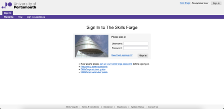
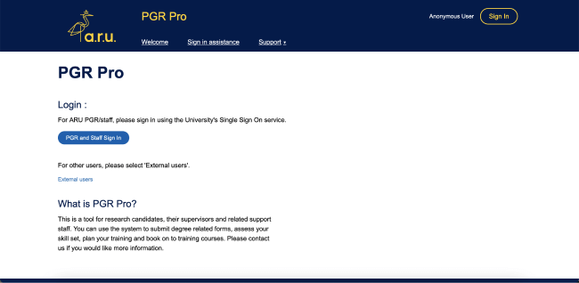
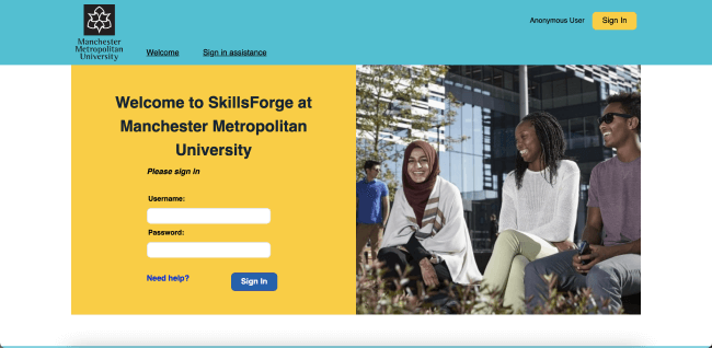
The following screenshots show the design system's flexibility, able to meet the brand requirements for both Anglia Rusking University as well as the Manchester Metropolitan University.
Alongside this, we have documentation that not only helps developers know when they should and should not use different components - it also helps to reassure and provide guidance to the customers as to why we are choosing certain components that we know will work to solve their user needs. To make this process even easier for both developers and customers, we implemented our designs in Figma components to allow for extremely quick prototyping for validation with users and customers.