Summary
The University of Bristol's Medical School needed an automated booking and payments system to replace their existing, manual processes.
This new system would require bespoke development of brand new features within the SkillsForge system. Given the way that Short Courses are released, the system would need to allow for a large amount of people to quickly book and checkout, making use of their allocated vouchers. I designed the user interface for the system, working with stakeholders at the University of Bristol to interview users and aided with the development and implementation within the SkillsForge team.
Problem space
Given the number of manual processes and different ways that individuals may choose to make and manage bookings, we discovered that building an automated system that would work for everybody proved difficult. As a result, I was asked to conduct user research into how the existing processes work in order to highlight room for improvements and standardisation within the process.
As the event management system within SkillsForge has existed for the best part of a decade, we would also have to build a user interface that could work with the legacy code - which would be consistent and not require a large amount of learning by people.
Methodology
I began work on this project by understanding the business requirements and the constrains that were in place for people when booking. I discovered rules that provided different vouchers for users depending on when they booked and the remaining number of vouchers for departments within the organisation. Beyond this, no further details had been discussed, the team at the Medical School and SkillsForge had been trying to solve waiting list and voucher problems to no avail.
Joining the project, I asked if it would be possible to talk directly to stakeholders in order to understand their experiences with the current manual booking processes and to attempt to understand wether there was any room for simplification within the specification for the project. I had 5 interviews lined up and travelled to Bristol to conduct semi-structured interviews, giving myself room to follow up on interesting points raised by those being interviewed. Conducting these interviews helped to raise a number of points of friction within the existing solution that had not been identified prior or as a result of reading the specification. We identified a large period of booking to be a point of friction, as well as problems with how people booking places on events did not always understand their voucher quota that would allow them to receive discounted prices.
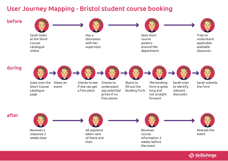
Following the stakeholder interview, I conducted a focus group with students and staff for which I had prepared storyboards in order to fully understand their thoughts and the user journey for the existing process, but primarily as a tool for facilitating ideas with an automated solution. The focus group contained a mix of staff, students and administrators and provided a unique opportunity for understanding the different needs of people while at the same time reinforcing shared problems that had started to appear - such as the difficulty in understanding voucher quota.


Upon returning to the SkillsForge office, I transcribed the interviews and focus group - extracting key phrases and quotes which had arisen as a result of the transcription process. Blending these with key statistics, business goals and specifications, I had a pool of data from which I conducted a thematic analysis. Working with two other developers, we grouped the data into different themes, which helped to reveal key focus points for the project. We began developing ideas as a team and fleshing them out with quick sketches and scenarios in order to test them against the specification. The user research that I had conducted provided us with an opportunity to really empathise with people and to listen to those with the most knowledge around the system that the University of Bristol would need.
In the next business call with Bristol we proposed a variety of different solutions which included:
- Offering a staggered event release, to prevent a huge rush of people booking to hold places - only to cancel nearer the time of the event.
- Providing a new, 'Register my interest' feature, to prevent people from booking just to hold a place.
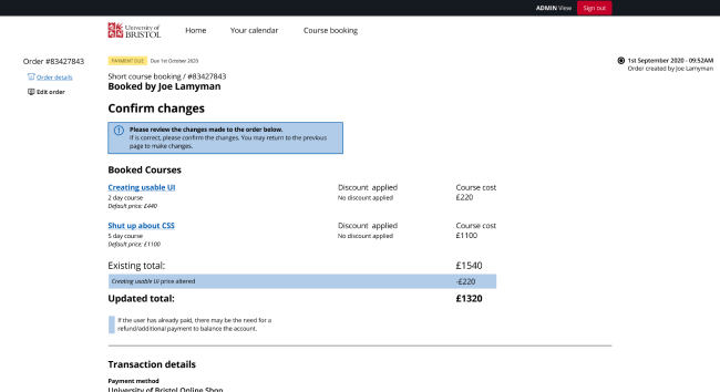
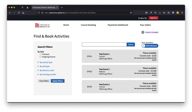
- An overhaul of the voucher allocation document, providing people with a clear summary of their remaining number of vouchers and giving them complete flexibility as to the events that they could be used on.
We received the go-ahead from the team at Bristol to develop and work on these ideas with them. For this, I was tasked with prototyping these solutions so that we could then demonstrate that they would still meet the goals of the institution. For this, I began designing some very quick proof of concept pieces within Adobe XD - which I then migrated to Figma for collaborative design with a colleague.

During the development of these prototypes it became clear that for testing a variety of different scenarios (which we needed to align with the specification), traditional prototyping tools were not sufficient. As a result, I created the interactive designs using HTML, CSS and JS which allowed us to conduct user testing with users on their own devices, as long as they had a browser.

We visited the Medical School again, taking the prototype to test with people in environments where they would be using the system. This helped us to understand further room for improvement within the designs that I had created, but also provided a tangible piece for the Short Course team to understand and provide feedback on. With a flexible, interactive prototype - we provided people with a few scenarios from which they were able to independently complete tasks and provide their feedback on.
Final design and results
Following the 2 rounds of in-person testing, the SkillsForge team worked in a series of short sprints to complete the development for the first release. I worked with the team to ensure that the designs were transferred into the existing system and helped out with implementing some of the front-end code using a mixture of HTML, CSS and JavaScript - making a few changes to new web components implemented in Polymer.
Following the launch of the University of Bristol Medical School's Short Course booking system, we received great insights into the process and how it worked:
- 98 people were able to find the booking they needed and checkout within the space of 1 minute after the system launched.
- After 48 hours of being live, the system had achieved 90% of the Medical School's target for yearly income.
The system had allowed for 533 bookings within the first 48 hours of launch. While there were some improvements that were noticed, we were delighted that so many people were able to book onto the courses and get instant feedback as to whether they had successfully booked their course. The system that we designed and developed ensures that people can understand their voucher allocation at any point in time and can use this to get the training that they need without the stress of having to find hundreds of pounds.