As part of my master's degree, I have designed and coded an interactive survey to help me gather information around people's preferences when it comes to personalising website user interfaces. Making any survey and then recruiting participants is a difficult process, but making enjoyable and interactive surveys can act as a method of recruitment and can produce richer information! How can we do this?
Survey tools
If you are looking for an easy way to create a quick survey, there are a lot of fantastic options. In my experience, I encounter Google Forms the most. Google Forms allow you to quickly create forms with defined question formats (such as multiple choice questions, sliders). This is great! Within a few minutes you can have a survey, hosted and ready to share. However, you're limited to asking questions that are afforded to you by the functionality that Google Forms offers and it also leaves you with the task of recruiting participants.
These quick to create surveys therefore tend to be a digital reincarnation of traditional paper surveys that came before them. The benefit of the web is the interactivity that we are afforded to us as designers and developers, let's make us of it!
Designing better experiences
In the past few months I have been inspired by two great examples of participatory design, involving the user and making them a part of the design experience.
- Is this a Sandwich? 🥪 by Sarah Drasner - It's a really fun project where you look at photos and decide whether the object in question is a sandwich or not (you'll quickly end up questioning everything). At the end, Sarah tells you your score, ranging from 'Chaotic Evil' to 'Lawful Good', depending on your choices. Then, you can share your results to Twitter and see who your friends really are.
- User Inyerface by Bagaar - This is a game that challenges you to make it through a user interface that reverses commonly understood user interface patterns. The balance between frustration, as you struggle to understand where on earth to click, and whimsy with comical interactions (see The Whimsical Web for more fantastic examples of this), is perfect.
Both of these projects provide delightful experiences. They put the participation and experience of the user before anything else.
Adapting interaction for surveys
As a student at the University of York, I'm currently researching whether we can use personalisation of user interfaces to increase the accessibility of websites. I wanted to conduct research to understand how people would want to personalise a website. What options would they choose? What would their personalised site look like?
Inspired by the two projects mentioned above and the support and guidance from my supervisors, I set out to create an interactive survey: Bog roll business builder. It's a website that challenges you with creating the perfect user interface for a website selling toilet roll (there's a pandemic story hidden in there somewhere).
Designing an accessible, interactive survey
My initial idea was simple, you would answer questions along the lines of:
- How big should the font be?
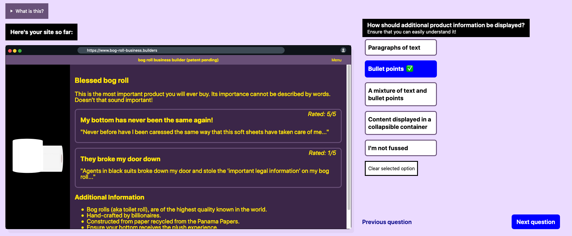
- How should product options be displayed?
- Where should the product image sit?
Then based on the answer you selected, a 'live' representation of the user interface you were creating would appear on the left of the screen.
I attended Cassie Evans' fantastic workshop on scalable vector graphics (SVGs) and SVG animation earlier this year and thought that this project would be a great opportunity to use SVGs to build the 'live' representation.
However, when I started implementing the site I quickly realised that using SVGs would not give the user the experience that I wanted. I needed the 'live' representation to be interactive, so that users could click around and understand how it worked and see if they were satisfied with the answers that they were choosing. In order to make the representation realistic and accessible to as many people as possible, I decided just to use HTML and CSS. Using these languages means that people can access the representation as they would any website on the internet. There is little JavaScript used, this was a conscious decision to make the website lightweight and more accessible to users who may not have a great internet connection.
Looking back, I decided that a hand-written HTML and CSS approach to this project would be fine, I thought that I would create 2-3 pages and as such, setting up a static-site generator or using a templating language would be overkill. I was very wrong. I would really recommend using a static-site generator when starting any project now. Personally I use Eleventy, it's straight-forward and really quick. It doesn't bloat your webpages with additional content like some generators do.
I was apprehensive to try to create an interactive study as while I am familiar with accessibility best practice and the Web Content Accessibility Guidelines, I knew that with the study I wanted to create, it would require shifting the user's focus between elements of the page. For keyboard and screen reader users this can be problematic for a few reasons. If you haven't structured your content properly or used incorrect semantic HTML, it makes navigating a site difficult. The other reason being that explaining focus shifts and making them clear and apparent, without confusing users, can be difficult.
My approach to this was to create a standard HTML5 form with a <fieldset> containing each question and answers. A field-set is a semantic way of grouping items within a form. As my form contains questions with multiple answers for the same question, grouping them with a <fieldset> makes it easy to understand which answers relate to which questions.
Within each <fieldset> is a <legend>, this tag provides a caption for the fieldset. In my website, I use the legend to display the question. For example:
<legend>How big should the font be?</legend>I have 3-4 different options that the user can select from for each question. These are displayed to the user as a large button, however, semantically they are HTML5 radio inputs (radio inputs as you can only select one per question). With some CSS styling, I use CSS Grid to quickly overlay the label on top of the radio input. The button that the user sees is actually the label (that's why there's no radio input in sight, they're just hidden behind the labels) styled to look like a button. Within HTML5, as long as you give a radio input a unique ID, you should use the for attribute on a <label> to create a semantic link. For example:
<input type="radio" id="my-cool-button">
<label for="my-cool-button">This is a great option</label>However, once a user selects an option, how do they review their choice and see what it's like in the 'live' preview?
Some users may be able to see the preview on the left of the screen and interact with it using their mouse. Other users, such as keyboard users and those using screen-readers may not be able to do this. As such, I use skip links to direct participants to the live preview, and then a skip link to quickly get them back to the questions. If you were to use the tab button to navigate through the site, you'll reach the questions, navigate through the multiple choice answers and after this, you'll hit a button that's visually hidden, 'Test this in the live website view'. Using HTML5 anchor elements, we can specify an ID for an element on the page, that the link will take the user to. The link above directs the user's focus upon the 'live' preview. As mentioned before, the preview is just HTML elements, so the participant can interact with these, as they would a normal website. Upon reaching the end of the representation, the user will tab onto another skip link, 'Back to questions', directing their focus to the start of the current question. This simple approach allows the survey to be as accessible to as many people as possible, regardless of their accessibility needs.
When trying to implement a site to make it as accessible as possible, it's key to focus on the semantic structure of the HTML. If you can really nail this, it goes some way towards making the website usable. Using simple methods such as skip-links can then bridge over any gaps to make the site more accessible.
How do the changing styles work?
I use a little bit of JavaScript to identify when a user has selected a radio input. Each radio input has a specific attribute applied to it, explaining what the option is. With JavaScript, I look at the attribute of the radio input that has been clicked, for example c-shopDisplay__bodyText--size-medium. While this may look nonsensical, it follows a pseudo structure and means that we can apply the styling the user has selected. This structure follows the CSS BEM naming principles (a way of naming your CSS classes for better understanding), we have a block, 'c-shopDisplay', an element 'bodyText' and a modifier, 'size-medium'. Breaking it down like this, we can see that the styling should be applied to the shop display (the 'live' display that I keep referring to), it relates to the body text and the size will be medium.
With this information, I apply a CSS class to the shop display. Doing so will then make the relevant option display in the case that the answer's different options have different HTML markup. However, if it's for something simple like changing the colour-scheme which doesn't require a change in HTML markup, I make use of CSS Custom Properties. These are essentially CSS variables, where you can give them a value and modify it elsewhere in your CSS. I do this by setting a default value in the CSS and then using CSS selectors, override this accordingly to display the colour that the user has selected. This method makes it quick and easy to allow for a personalised user interface. It's just a case of setting and removing CSS classes, there is nothing else involved.
How is the most popular design displayed?
Once a user creates their design, I submit their answers to a database, providing them with a 3 word randomly generated ID (a bit more user friendly than some crazy 16 digit number and it's funny to get IDs like stinky-mouse-thief). I store an individual record for the user so that their design can be quickly picked up displayed later on. I also have a record for each question which contains the number of times that an answer has been selected, the user's answers will contribute to these records. I do this so that I can quickly query a single record as to the most frequently selected answer for a single question and quickly display the most popular site to users.
To make this possible, I hosted the site with Netlify. Netlify hosts personal static-sites for free (I'm hosting this website for free)! This is great for prototyping or individual portfolios. Netlify's free tier is super generous and allows you to use functions, this is really important. A traditional static site is exactly that, static. It can't do much as the HTML and CSS has already been written. However, it can use JavaScript to change and update the HTML in the user's browser. My site does exactly this, it uses JavaScript to send user's answers and request the most popular site using Netlify's functions. You can see this in practice once you have created your design and it is compared against the most popular site. The information for the most popular site has been passed from my database, through a function and displayed using JavaScript.
How do Netlify functions work?
Netlify's functions provide us with an API endpoint which we can access through JavaScript. For example, when a user submits their survey answers, we can say to our API (that we've just created), "here's a bunch of data". Netlify will then pass this data to functions that you've created. I created JavaScript functions (using a framework called Express) to take data and store it in the database, once done it redirects the user. You're essentially writing your own API to process data requests however you want. If any part of that sounds nonsensical to you, that's probably because it is. I did not know how to do any of this before starting my website (it was a very steep learning curve).
After the user has designed their site
At the end of the interactive survey, I then make use of a quick Google Form to capture contextual data from participants. I ask questions about their purchasing habits and accessibility needs.
By creating better experiences that further engage users, you may get richer feedback and information from participants. They have felt involved in the process and will want to explain their answers.
Following this, I then show them the design that they have created alongside the most popular design made up of the most frequently selected choices from the bog roll hive mind. This is purely for the participants' experience so that they can compare their own design to the most popular.
A great thing about interactive studies is that they have an output that can be shared on social media, which works as an entry for other potential participants. I found Sarah's 'Is This A Sandwich' project through a lot of people I follow on Twitter sharing their results, which in turn, made me want to take part!
In fact, here's a bog roll design I made earlier.
Reception
I am super appreciative that people have taken the time to share my work online, here's a few tweets about the work.
For all my students. This questionnaire created using @Netlify by @JoeLamyman is a great example of how to design questionnaires that people actually want to complete. https://t.co/IGRTLeOkFk
— Francis Muir (@francismuir) August 14, 2020
definitely do this 👇 https://t.co/yXfyRId0TY
— Andy Bell (@hankchizljaw) August 12, 2020
Wrapping up
I hope that this article inspires you to create more interactive surveys that people will want to complete. I look forward to seeing and partaking in them in the future!
If you are about to go out and create interactive surveys, make sure you do the following:
- Accessibility test your survey to ensure that as many people as possible can easily complete it, without any issues. This is key.
- Value your participants' time, ensure that the experience is quick and does not require too much of their time. Anywhere between a couple of minutes to 10 minutes seems like the sweet spot.
- Ensure that participants know how their information will be stored and used.
If you have any questions about resources for anything mentioned in this article, please feel free to get in touch with me. A lot of what I used was brand new to me, I have had to learn about Netlify Functions, AWS Lambda Functions, MongoDB and more! If you're struggling or just interested, send me a message and I'd be happy to provide more technical information.